
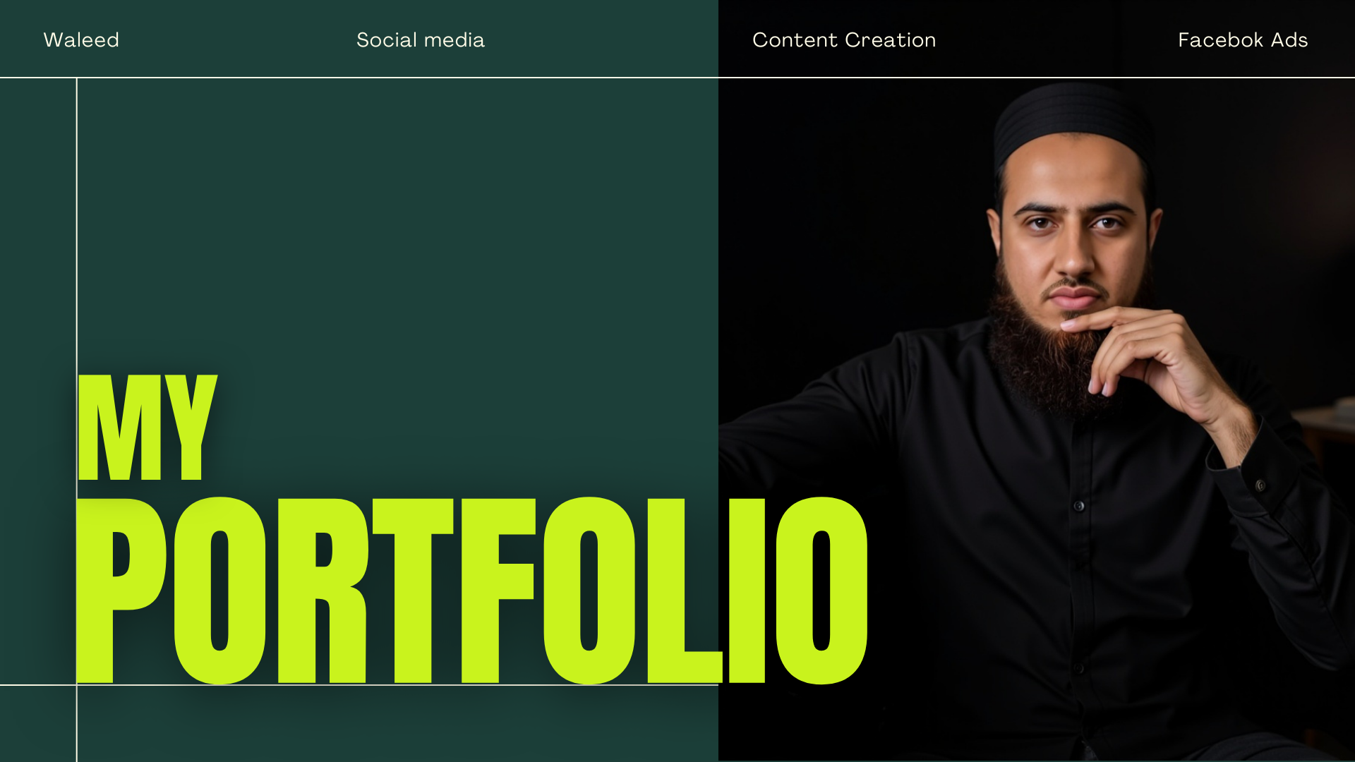
Here’s a look at some of the projects I’ve worked on — from managing social media pages and running Facebook ads to planning full campaigns, creating engaging content, and developing strong brand identities. Each project reflects my goal: to help nonprofit organizations share their stories, grow their audience, and make a lasting impact online.
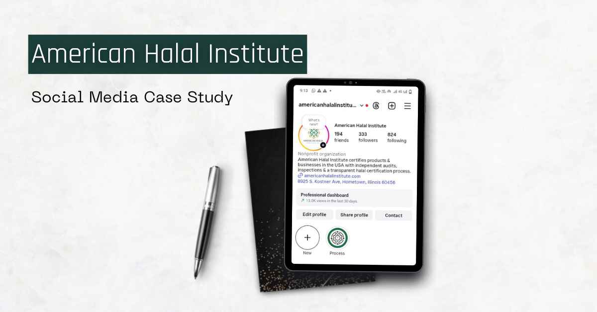
Social Media Strategy & Campaign Case Studies


Brand Identity & Visual Systems for Nonprofits
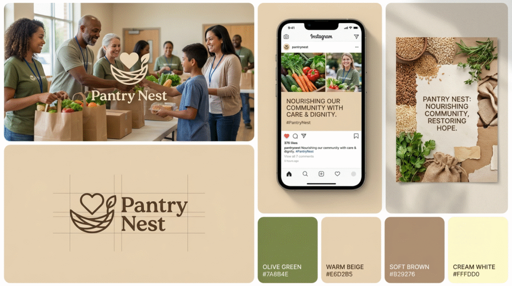
Pantry Nest (Food Pantry)
While designing Pantry Nest, I noticed that many food pantries struggle to create an emotional connection online — their work is impactful, but their branding doesn’t reflect it. So I created a warm, human-centered identity that highlights dignity, care, and community rather than just “food distribution.” From social media templates to visual direction, everything was designed to make donors feel connected to real people behind the mission. The result is a brand that doesn’t just inform, but makes people feel — which is what drives engagement and support.
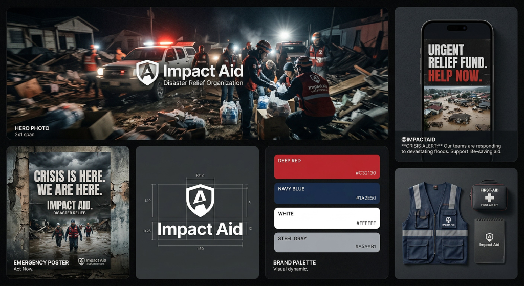
Impact Aid (Charity Organization)
When I conceptualized Impact Aid, I focused on a common issue I see in early-stage disaster relief organizations — they need to communicate urgency, but without losing trust or clarity. Instead of overwhelming visuals, I built a grounded brand system centered on real human action, clear messaging, and strong visual hierarchy that can be deployed quickly during emergencies. The goal was simple: help the organization look reliable in critical moments so people feel confident to support and donate. This approach ensures every post, campaign, or update feels consistent, credible, and action-driven.
HomelessAid (Homeless Shelter)
For HomelessAid, the biggest challenge I wanted to solve was how to communicate homelessness with dignity — something many organizations unintentionally struggle with. Instead of dramatic or insensitive visuals, I focused on a calm, respectful, human-first brand system that reflects safety, support, and trust. Every element, from color palette to content style, was designed to shift the narrative from “sympathy” to “human connection.” This kind of branding helps organizations build deeper trust and long-term engagement with their audience.
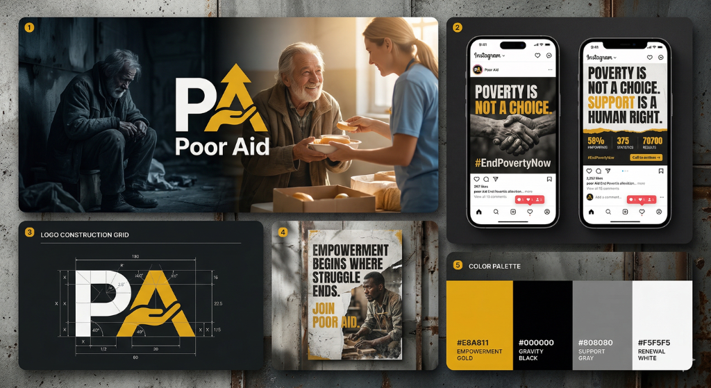
Poor Aid (Nonprofit Poverty Org)
When working on Poor Aid, I explored how poverty-focused organizations often fail to balance awareness with hope — either the message becomes too heavy or too generic. I created a bold yet realistic brand identity that uses contrast and storytelling to highlight both the problem and the possibility of change. The system is designed to stop the scroll, spark awareness, and guide the audience toward action without exaggeration. It’s not just about visuals — it’s about making the message impossible to ignore.
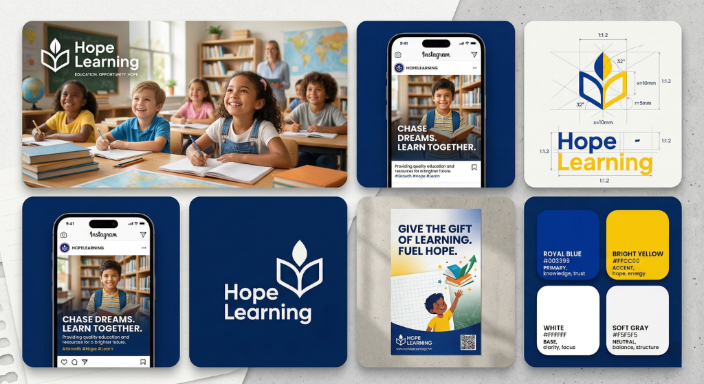
Hope Learning (Education Nonprofit)
For Hope Learning, I focused on a key gap in many education nonprofits — they do incredible work, but their branding doesn’t reflect growth, opportunity, and impact. I developed a clean, uplifting identity that visually communicates hope and progress, making it easier to connect with donors, parents, and supporters. The system ensures that every piece of content reinforces a simple message: education changes lives. This kind of clarity helps organizations inspire action, not just attention.
Pantry Nest (Food Pantry)
While designing Pantry Nest, I noticed that many food pantries struggle to create an emotional connection online — their work is impactful, but their branding doesn’t reflect it. So I created a warm, human-centered identity that highlights dignity, care, and community rather than just “food distribution.” From social media templates to visual direction, everything was designed to make donors feel connected to real people behind the mission. The result is a brand that doesn’t just inform, but makes people feel — which is what drives engagement and support.
Impact Aid (Charity Organization)
When I conceptualized Impact Aid, I focused on a common issue I see in early-stage disaster relief organizations — they need to communicate urgency, but without losing trust or clarity. Instead of overwhelming visuals, I built a grounded brand system centered on real human action, clear messaging, and strong visual hierarchy that can be deployed quickly during emergencies. The goal was simple: help the organization look reliable in critical moments so people feel confident to support and donate. This approach ensures every post, campaign, or update feels consistent, credible, and action-driven.
HomelessAid (Homeless Shelter)
For HomelessAid, the biggest challenge I wanted to solve was how to communicate homelessness with dignity — something many organizations unintentionally struggle with. Instead of dramatic or insensitive visuals, I focused on a calm, respectful, human-first brand system that reflects safety, support, and trust. Every element, from color palette to content style, was designed to shift the narrative from “sympathy” to “human connection.” This kind of branding helps organizations build deeper trust and long-term engagement with their audience.
Poor Aid (Nonprofit Poverty Org)
When working on Poor Aid, I explored how poverty-focused organizations often fail to balance awareness with hope — either the message becomes too heavy or too generic. I created a bold yet realistic brand identity that uses contrast and storytelling to highlight both the problem and the possibility of change. The system is designed to stop the scroll, spark awareness, and guide the audience toward action without exaggeration. It’s not just about visuals — it’s about making the message impossible to ignore.
Hope Learning (Education Nonprofit)
For Hope Learning, I focused on a key gap in many education nonprofits — they do incredible work, but their branding doesn’t reflect growth, opportunity, and impact. I developed a clean, uplifting identity that visually communicates hope and progress, making it easier to connect with donors, parents, and supporters. The system ensures that every piece of content reinforces a simple message: education changes lives. This kind of clarity helps organizations inspire action, not just attention.
Need help with your nonprofit’s social media or branding?
Book a Free Call
Let’s Grow Your Mission Online
If you’re ready to strengthen your nonprofit’s social media & digital presence and connect with the person who care about your cause, Let’s Talk.
Email Address
hello@mwaleed.org